You can now simply talk to computers and ask them to show you anything you want. Of course the first thing that comes to mind would be what the bigger picture of the tightly cropped classic KISS album covers look like – here is what Adobe’s A.I. Generative Fill sees, or imagines…
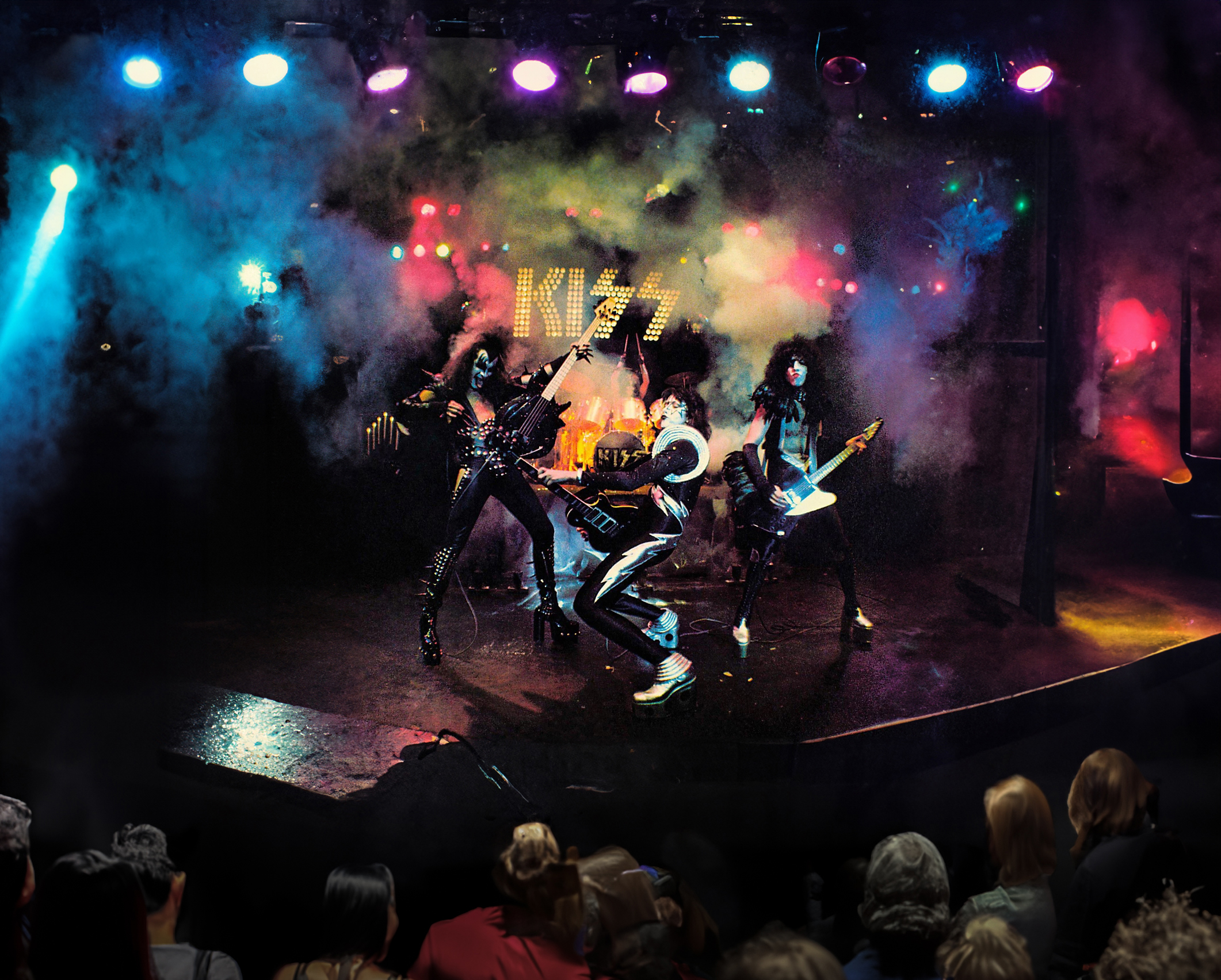
 KISS Alive! from 1975 never looked better with the added crowd, lighting rig and expanded stage.
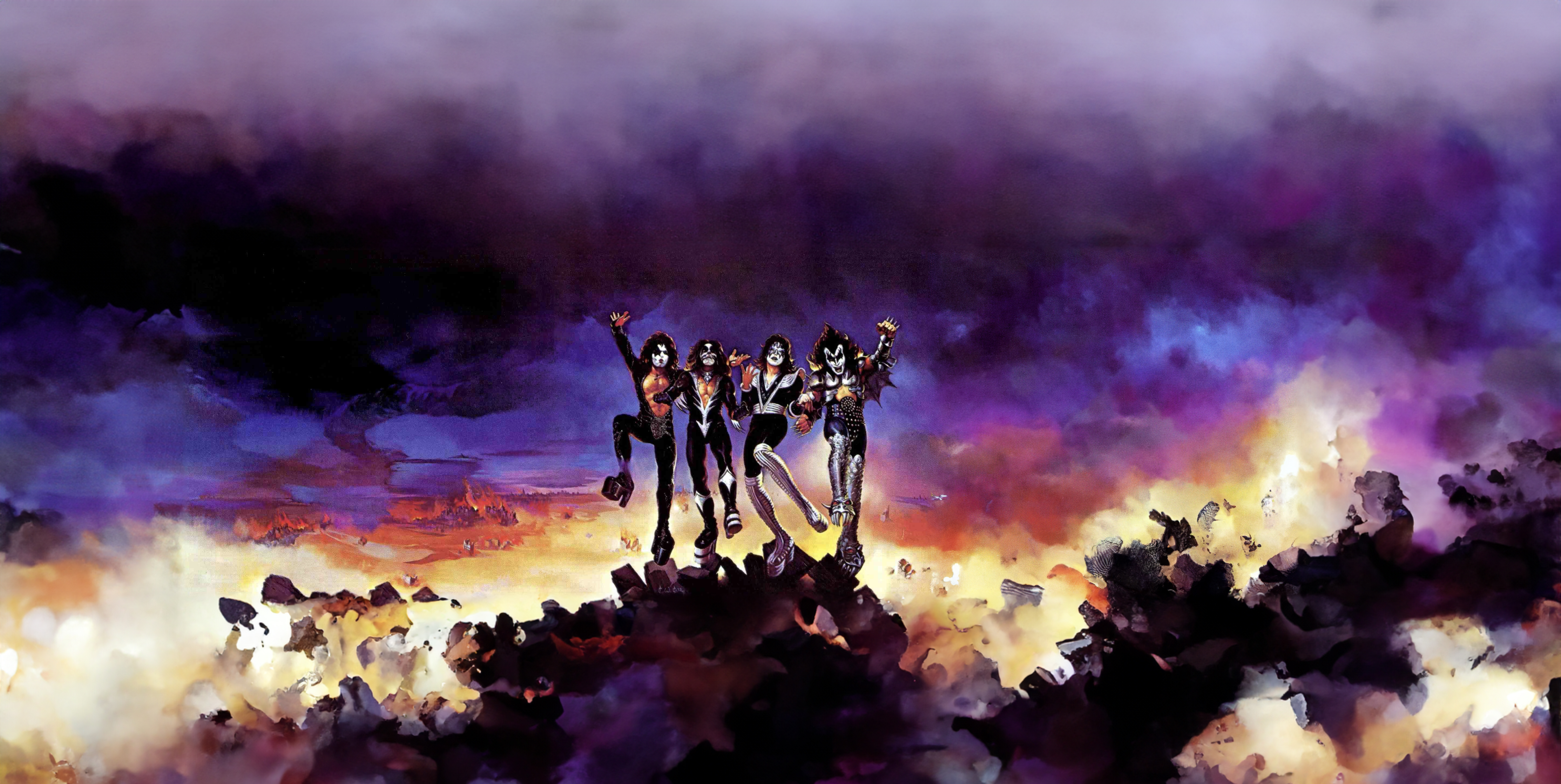
The apocalyptic desolation of the Destroyer album cover looks like it could go on for miles and miles.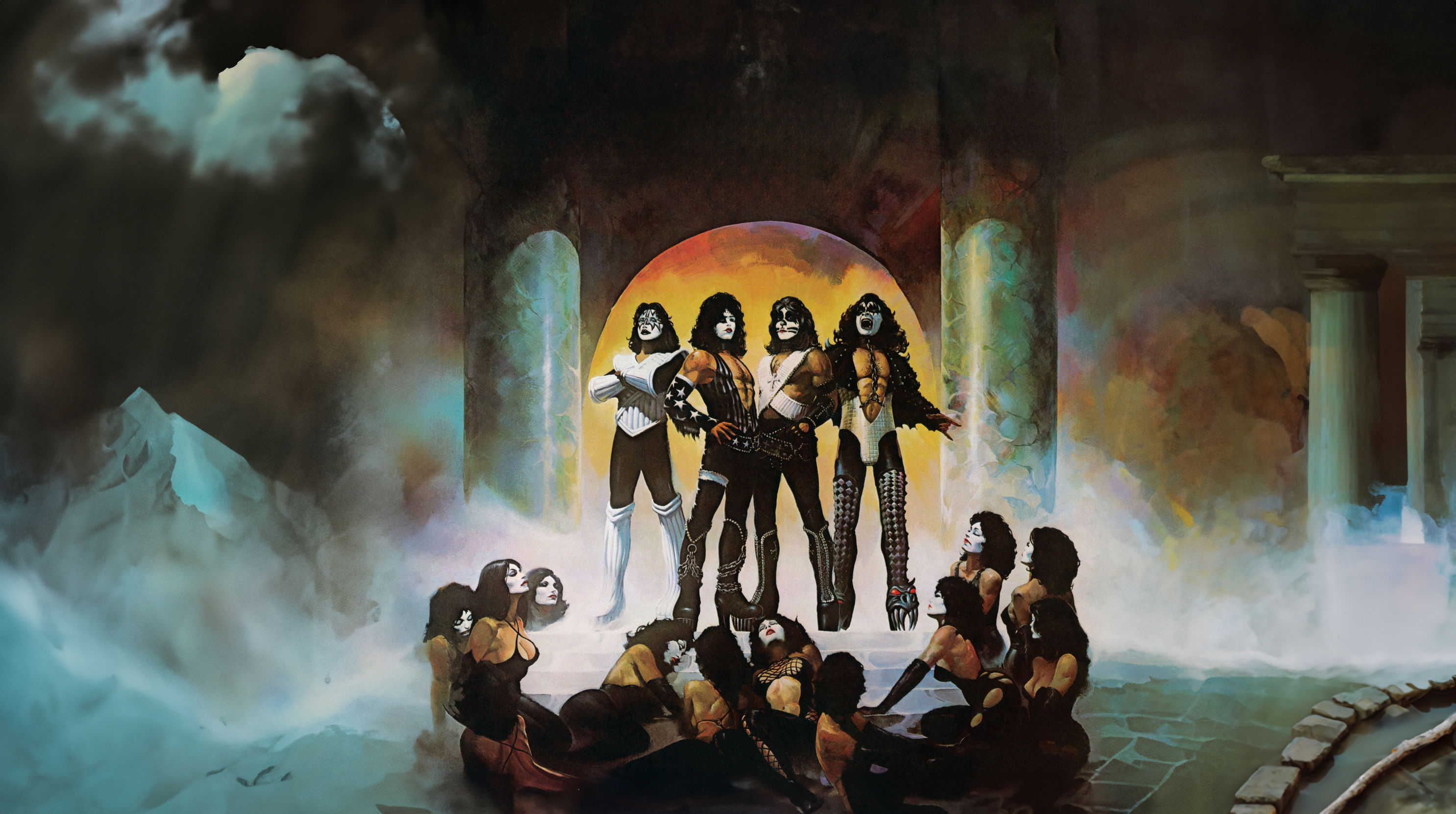
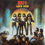
Who knew there was an extended palace and mountains in the background of this iconic image.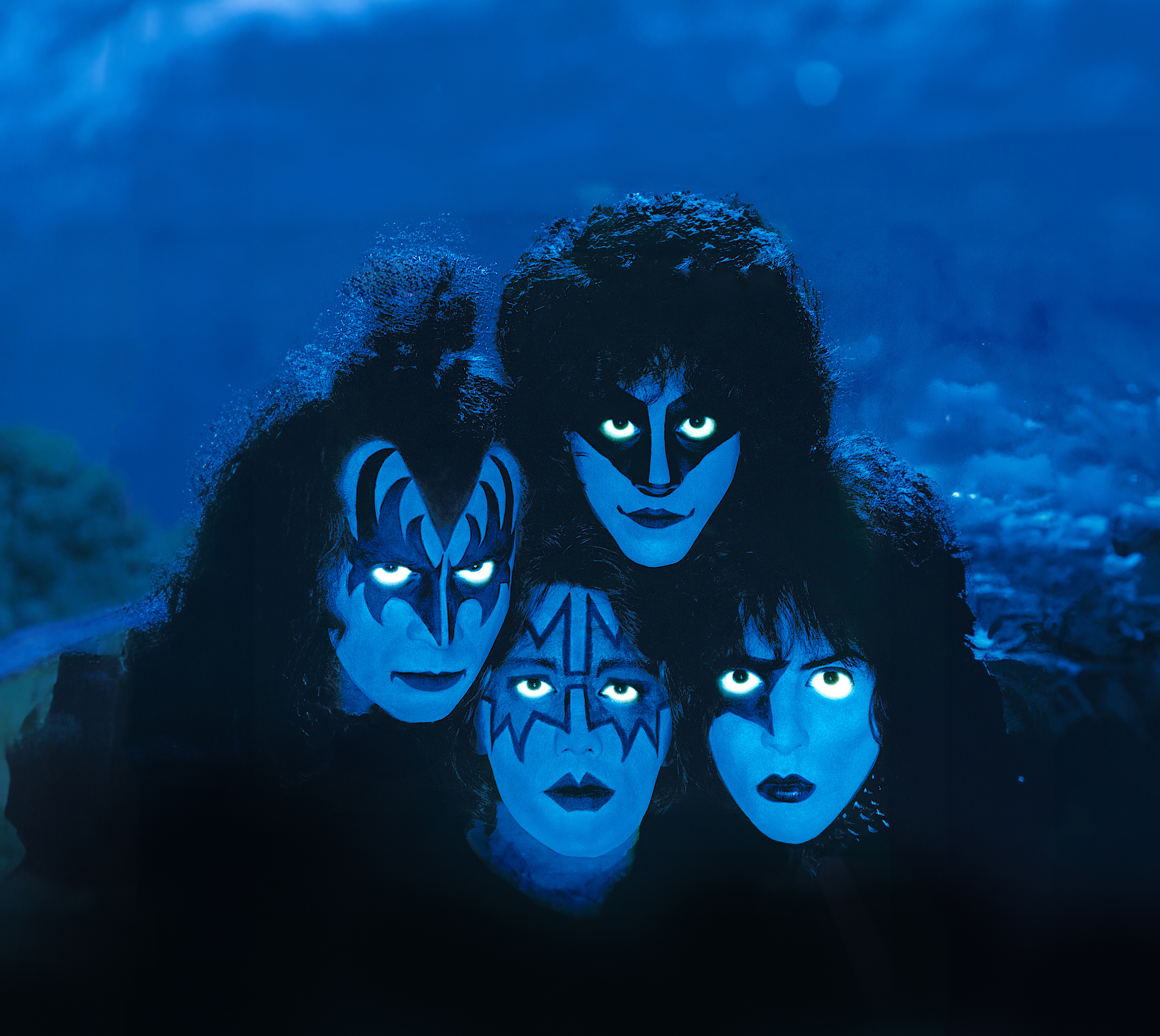
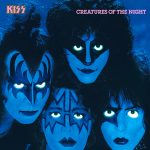 It always irked us that the faces of Ace and Paul were cut off considerably on this album cover, but A.I. can see that along with the hidden night time land scape beyond.
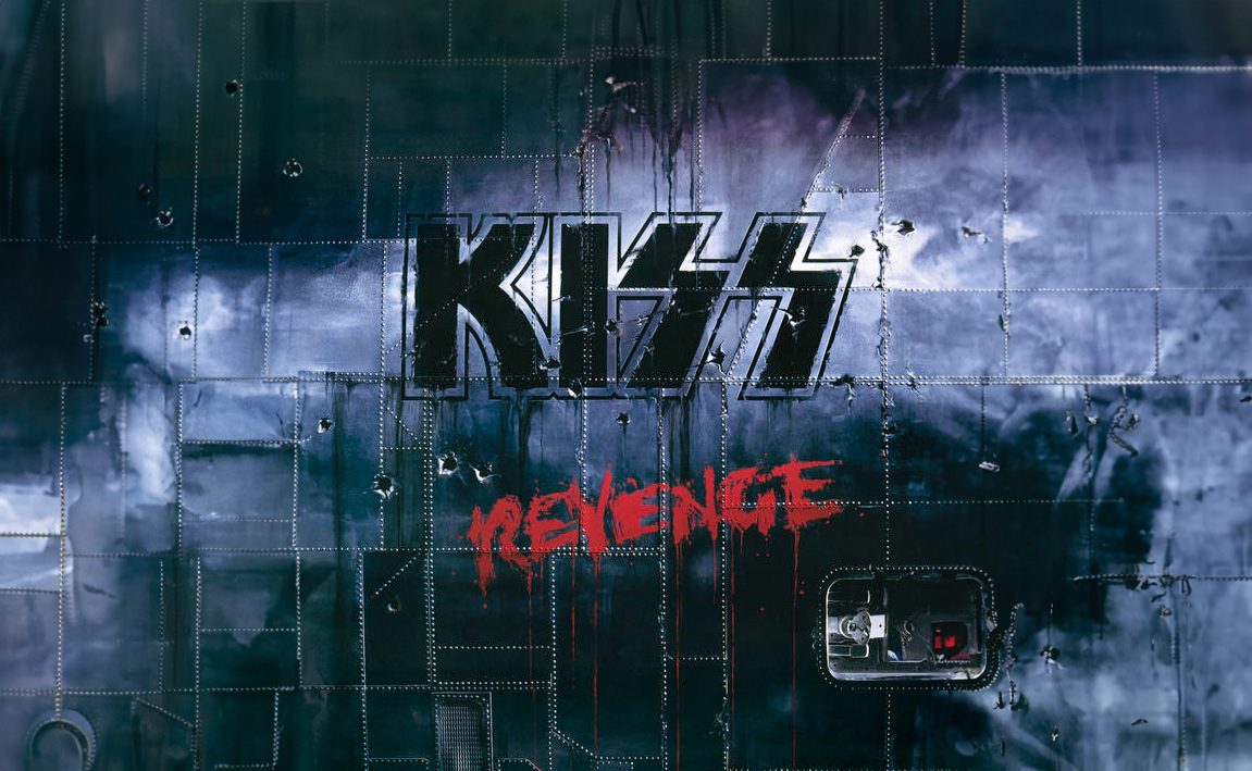
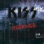
We were hoping the Revenge metal panel would expand into a cool battleship or something, but it seems like it’s just a wall that will go on and on forever.
